Choosing the Right Color Palettes for Diverse Space Needs
Key Takeaways
- Commercial and residential color palettes serve different purposes and audiences.
- Color psychology boosts productivity in commercial spaces and creates comfort at home.
- Distinct palettes work best for offices, retail, restaurants, healthcare, living rooms, bedrooms, kitchens, and bathrooms.
- A step-by-step process and current trends are key to successful color selection.
What Are the Key Differences Between Commercial and Residential Color Palettes?
Commercial color palettes focus on function, brand identity, and productivity. In these settings, colors are chosen to communicate professionalism and, in many interior painting services Rhode Island projects, to boost employee efficiency and reflect a strong brand identity. For example, offices often use minimalistic blues and grays to promote calm and concentration, while retail spaces might incorporate vibrant hues to grab customer attention.
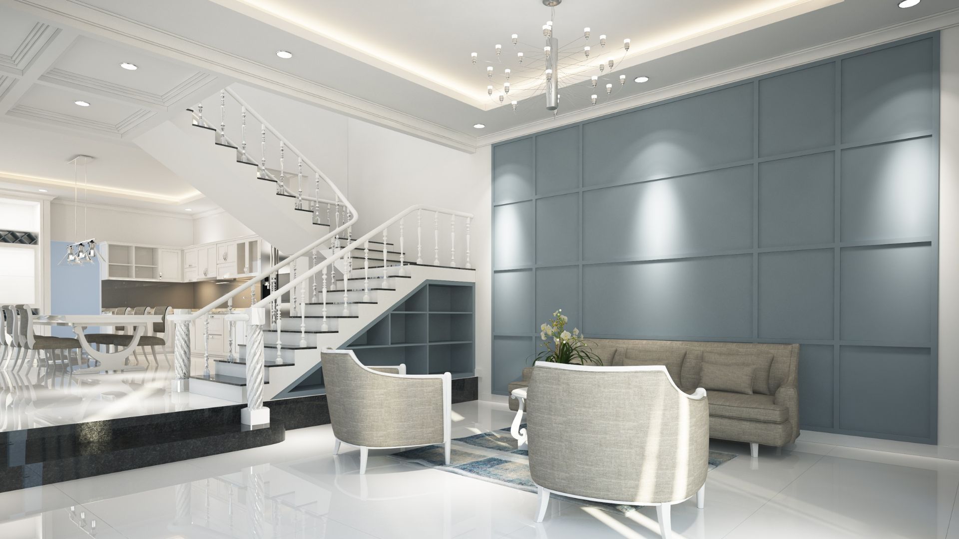
In contrast, residential palettes center on personalization and comfort. Homeowners often collaborate with interior painting services Rhode Island professionals to select colors that evoke relaxation and warmth—often using beiges, soft greens, and muted blues—to create inviting environments that reflect personal tastes and lifestyles.
How Does Space Functionality Influence Color Choices in Commercial vs. Residential Settings?
Functionality drives color choices. Commercial spaces require colors that support varied activities—meeting rooms and offices benefit from cooler shades that aid concentration, while retail areas might use brighter tones to energize and guide customers. Residential settings, however, tailor colors to specific room functions: bedrooms use soft tones for rest, and kitchens may incorporate clear, crisp colors to enhance cleanliness and space.
What Role Does Brand Identity Play in Commercial Color Palette Selection?
Brand identity is key in commercial design. Colors must complement a company’s existing branding—from signage to uniforms—to build recognition and evoke the intended customer emotions. For instance, a financial institution might choose deep blues to signal stability, while a tech startup may prefer modern, vibrant hues to indicate innovation.
How Do Personal Preferences Shape Residential Color Palettes?
Residential color choices are inherently personal. Homeowners experiment with textures, blend neutrals with accents, and sometimes follow cultural or traditional aesthetics. Unlike the structured approach in commercial spaces, residential design is flexible, allowing greater creative freedom to reflect individual personality and comfort.
How Does Color Psychology Affect Commercial and Residential Design?
Color psychology studies how hues impact mood and behavior. In commercial environments, colors like blue and green are valued for boosting productivity and calm, whereas red and orange are used selectively to stimulate energy and appetite in dining or retail contexts. In homes, softer shades promote relaxation and emotional well-being, creating restful areas in living rooms and bedrooms. Designers use these insights to choose hues that align with the purpose of each space.
Which Colors Boost Productivity and Customer Experience in Commercial Spaces?
Light blues and greens are common in commercial interiors for their stress-reducing and focus-enhancing properties. Offices often use these as primary colors, accented with a sparing use of yellow to stimulate creativity in collaborative spaces. Neutral backgrounds further highlight branded elements and sustain a professional look.
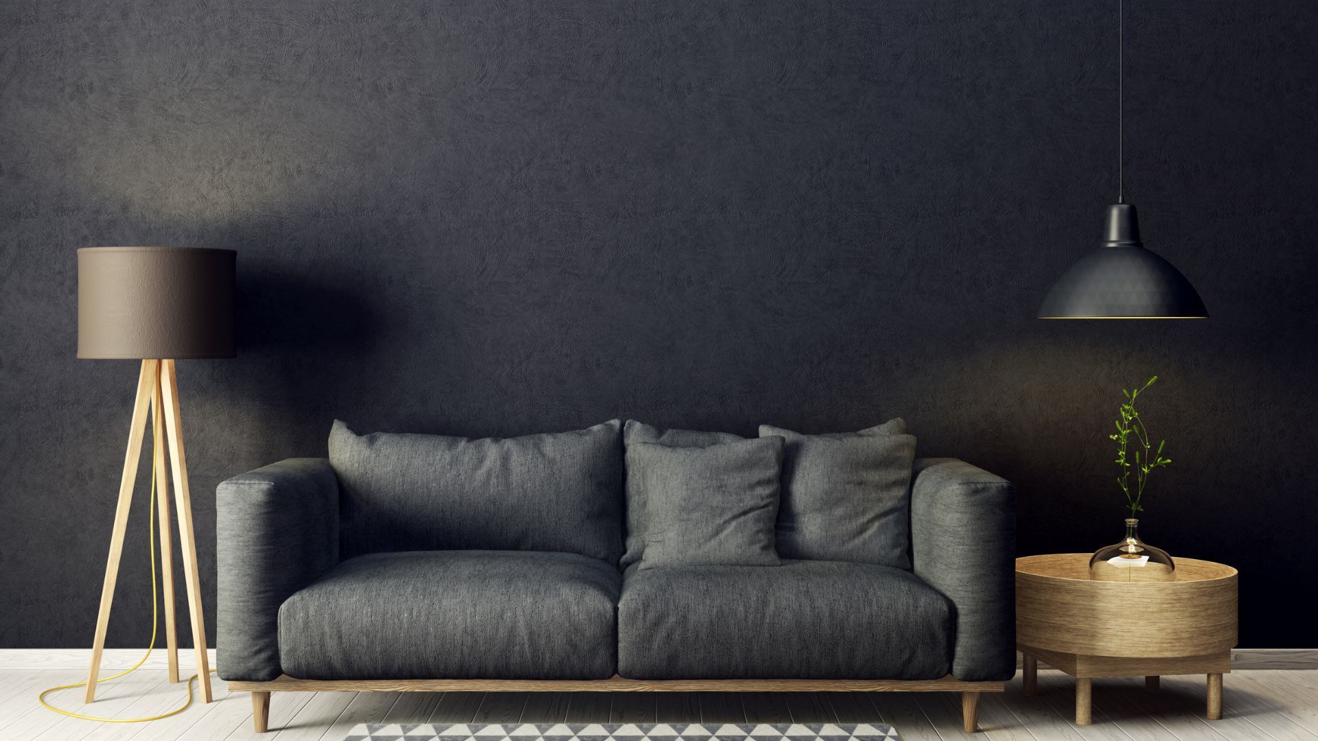
How Do Colors Create Ambiance and Comfort in Residential Spaces?
Warm and soft hues create a cozy ambiance in homes. Pastel blues, beiges, and muted greens reduce stress and improve the overall sense of comfort. In living rooms, such colors foster relaxation, while in kitchens, light and airy tones also help brighten the space and convey hygiene.
What Are the Emotional Effects of Common Commercial and Residential Colors?
In commercial settings, blue and green project trust and efficiency; in residential spaces, the same colors can evoke serenity and natural calm. Warm tones like red and orange, if used in moderation, can energize a commercial environment but may overwhelm a home if overused. Balancing intensity and context is essential to achieve the desired emotional outcomes.
What Are the Best Color Palettes for Different Commercial Spaces?
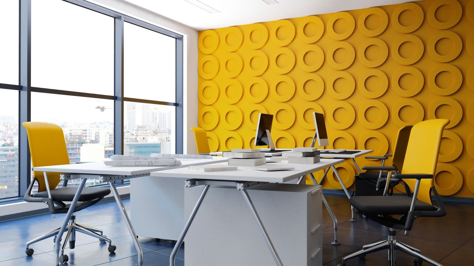
Successful commercial design aligns color choices with both function and brand needs. Offices typically use cool, neutral shades such as light blue or gray, accented with brighter colors to maintain focus. Retail spaces often incorporate vibrant hues like red or yellow to draw attention to products, balanced by neutral backdrops to avoid visual overload.
Restaurants benefit from warm, inviting palettes that combine deep reds, oranges, and earthy browns to stimulate the appetite. In healthcare facilities, soft greens and light blues create a calming, clean environment that supports patient comfort and recovery.
Which Color Schemes Work Best for Offices to Enhance Productivity?
Office environments thrive on calm yet professional color schemes. Primary walls in blue or gray, complemented by strategic use of brighter accents and splashes of green, help reduce fatigue and promote employee focus. Incorporating biophilic elements further reinforces the connection to nature and overall well-being.
What Are Ideal Retail Space Color Palettes to Attract Customers?
Retail spaces use energetic color combinations to attract attention and encourage impulse buying. Bold hues such as red or orange are effective when paired with neutrals like white or beige, creating clear visual hierarchies that guide the shopper’s journey.
How Should Restaurants Use Color to Influence Dining Experience?
Restaurants rely on warm hues to set a relaxed pace and stimulate hunger. Deep reds and rich oranges create an inviting atmosphere, while softer accents and subtle lighting maintain a balance that keeps diners comfortable and engaged.
What Colors Are Recommended for Healthcare Facilities?
Healthcare design prioritizes calmness and cleanliness. Soft greens, light blues, and neutrals are favored to soothe patients and reduce anxiety, with white or off-white elements enhancing the sense of sterility and order.
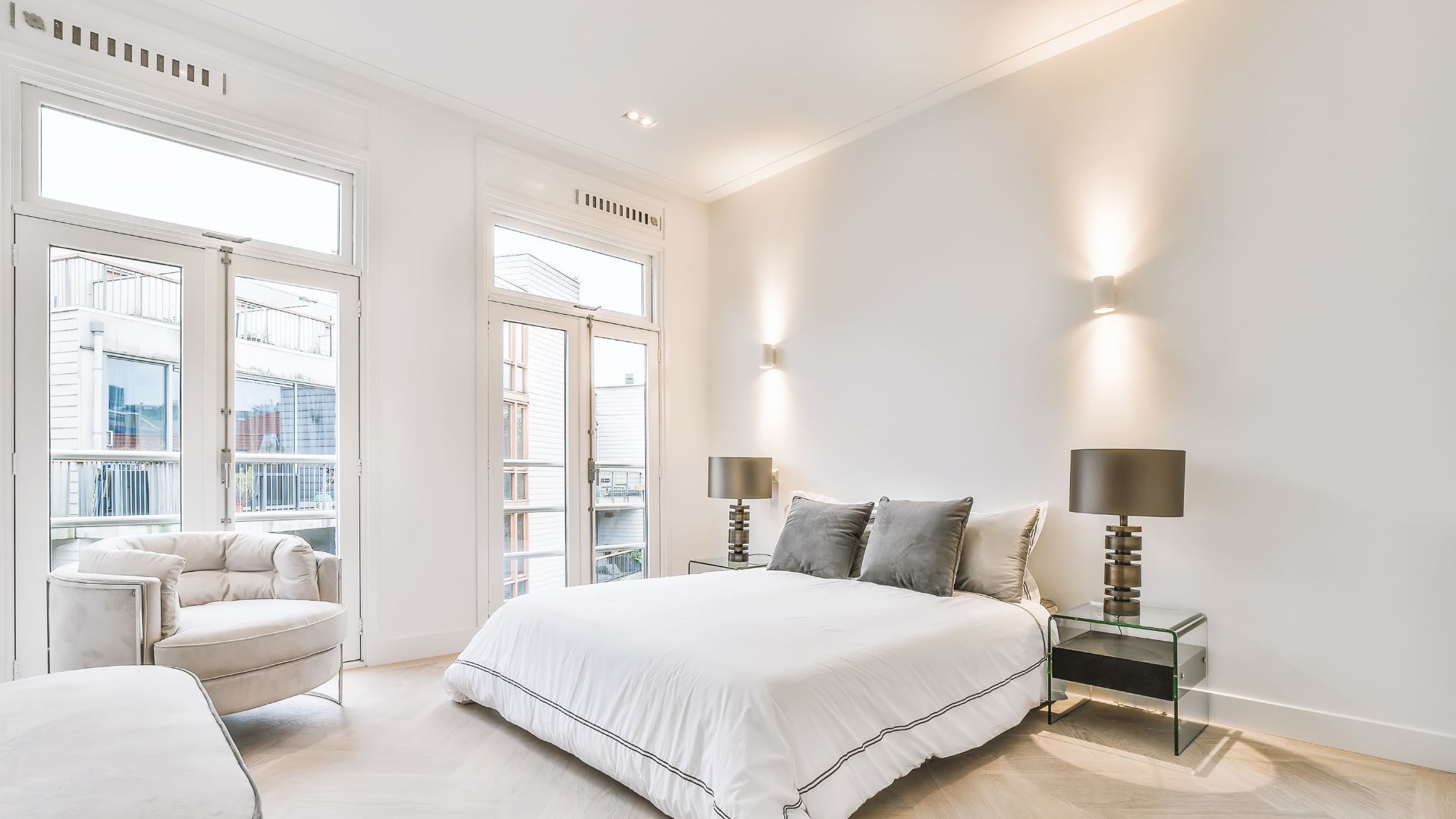
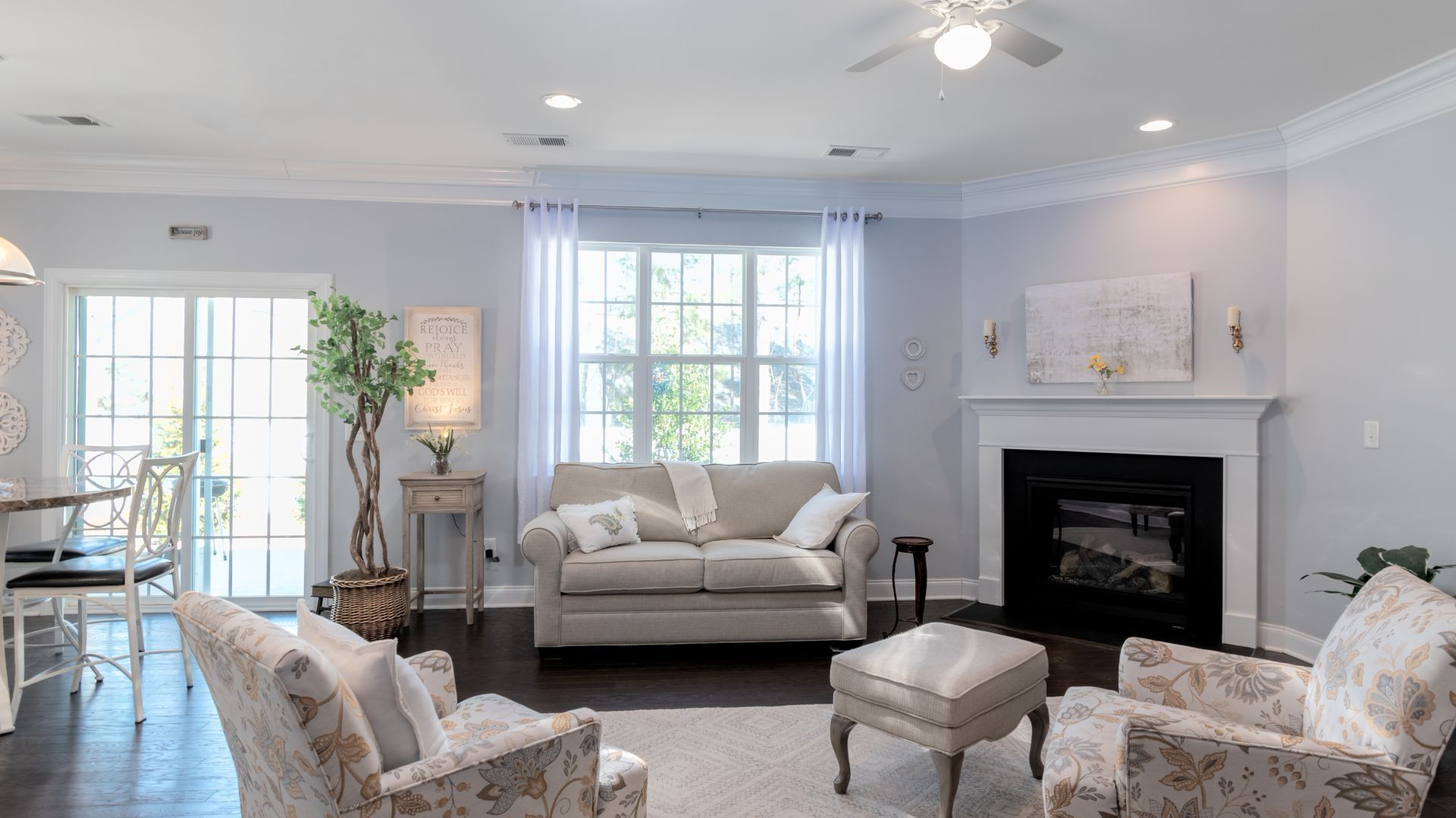
What Are the Top Color Palettes for Various Residential Rooms?
Residential color schemes are highly customizable based on room function. Living rooms benefit from a mix of neutral backdrops paired with accent pieces to create a spacious, inviting feel. Bedrooms call for soft, muted colors that promote relaxation and restful sleep, while kitchens often combine light base colors with vibrant accents for a bright, functional space. Bathrooms typically use cool tones and crisp whites to convey cleanliness and calm.
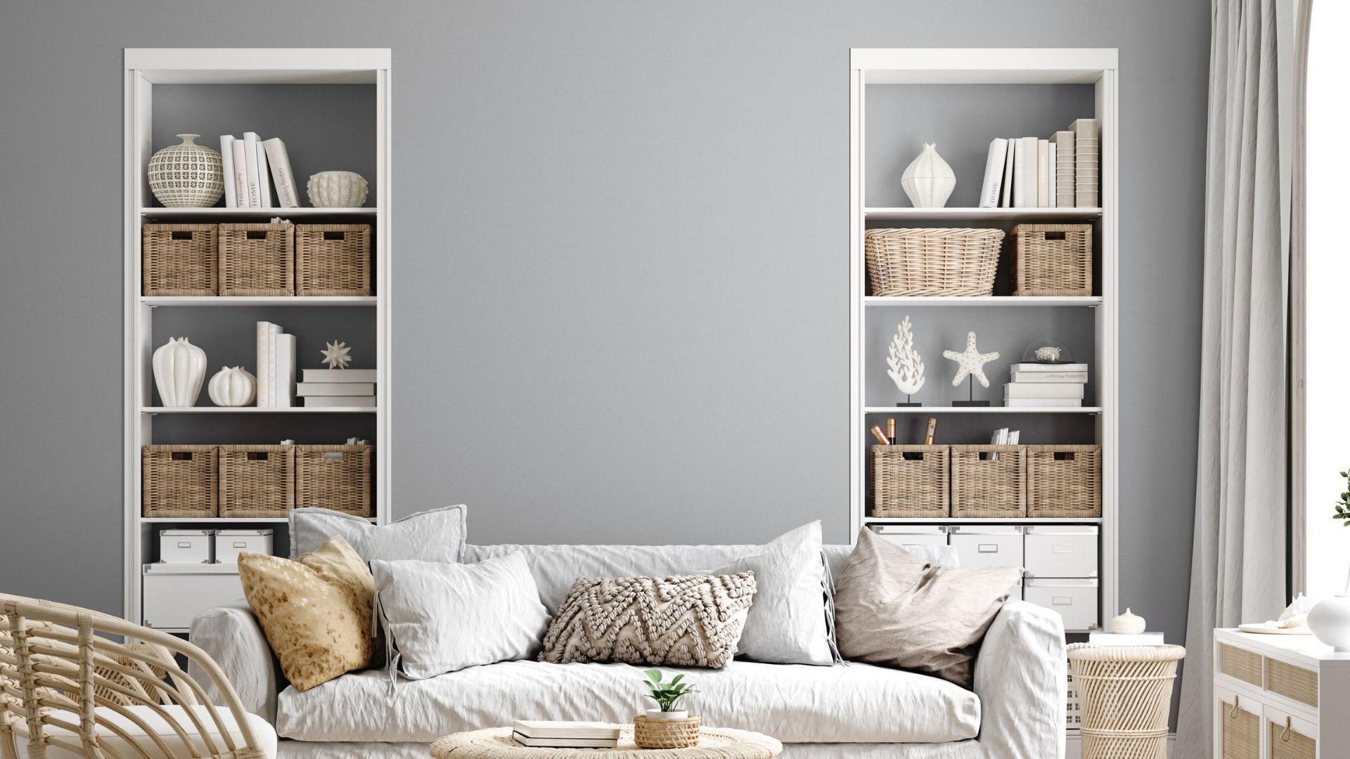
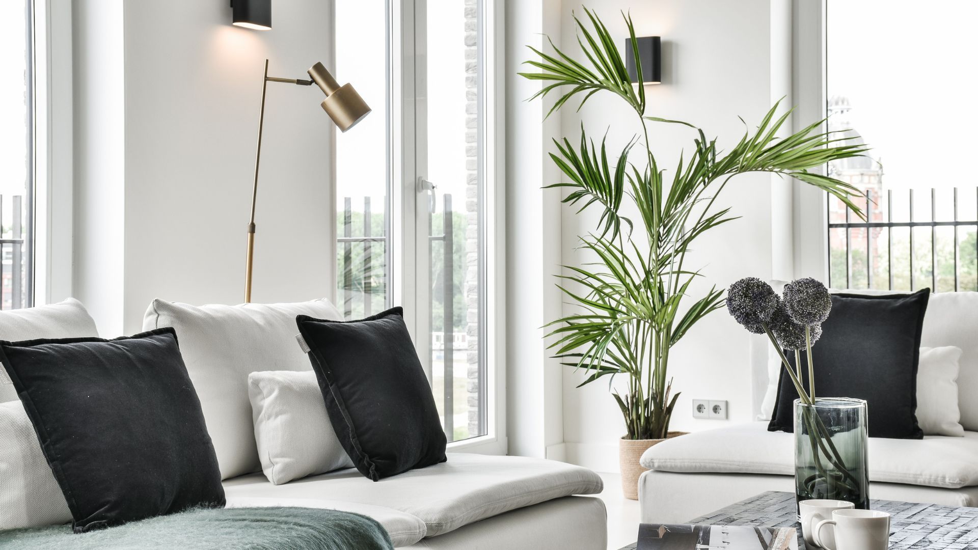
How to Choose Living Room Colors for a Welcoming Atmosphere?
A balanced living room palette uses light neutrals for flexibility and space, with warm accent colors like burgundy or mustard adding character without overwhelming the room.
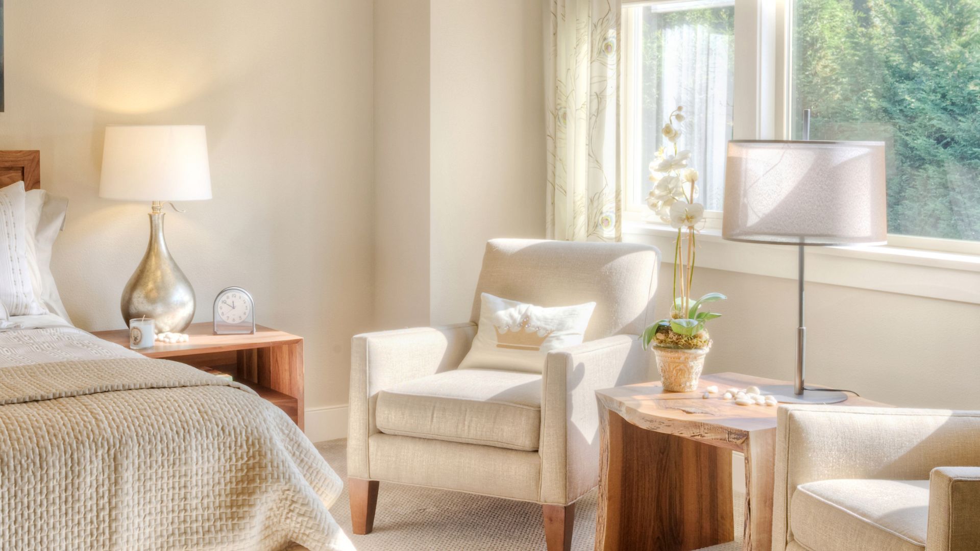
What Bedroom Color Schemes Promote Relaxation?
Soft pastels such as light blues, lavender, and gentle greens create a tranquil bedroom environment. These colors reduce stress and encourage better sleep, enhanced by subtle accent details in bedding and décor.
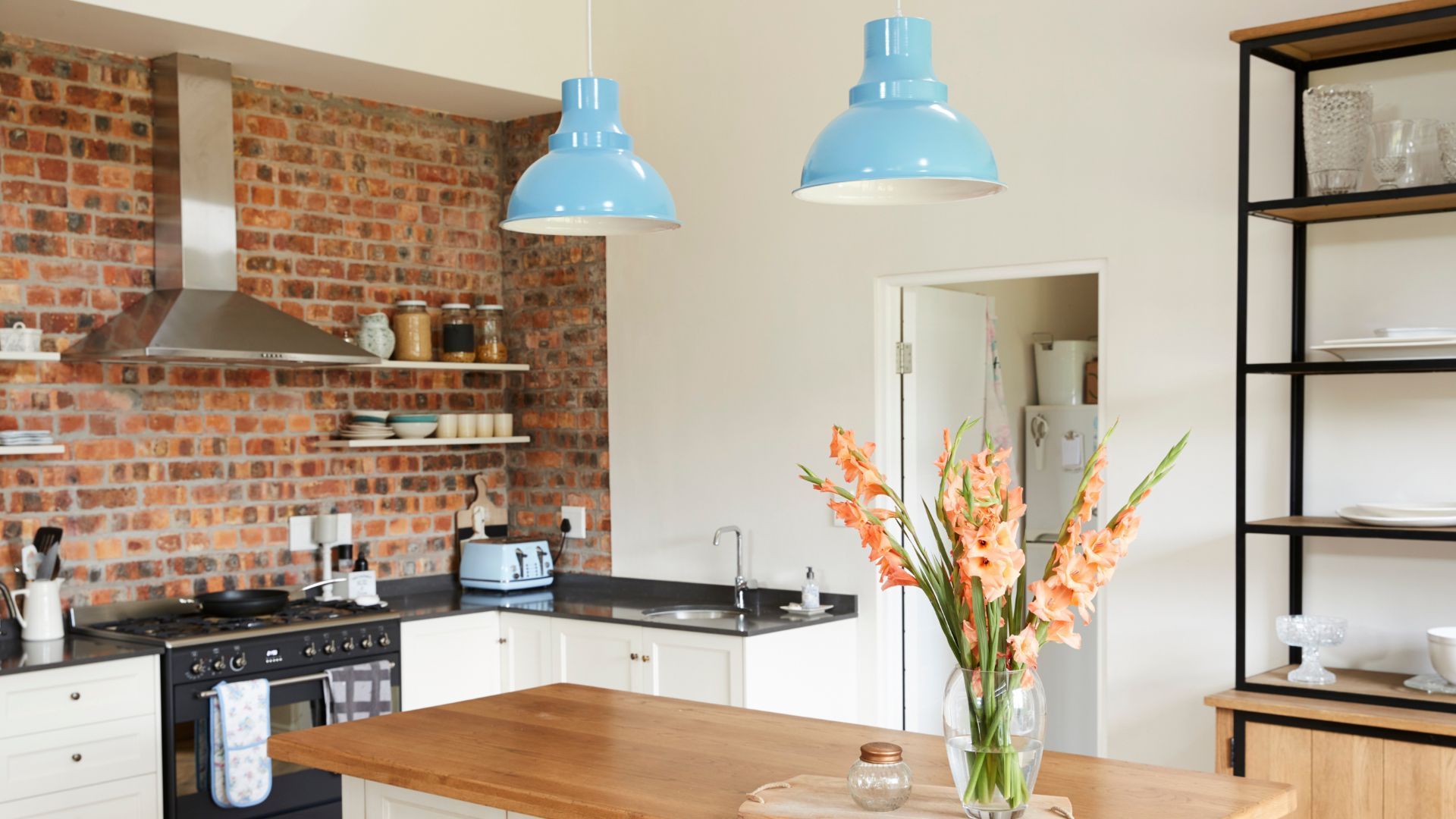
Which Kitchen Colors Enhance Functionality and Style?
Kitchens benefit from light, reflective colors—white, cream, or pale gray—that visually expand the space. Vibrant accents, such as a red backsplash or colorful accessories, inject energy and personality without sacrificing cleanliness.
What Are the Best Bathroom Color Palettes for Cleanliness and Calm?
Bathrooms should feature crisp, cool tones—combining whites, grays, and soft blues—to emphasize hygiene and create an open, fresh feeling. The choice of finishes, whether matte or glossy, supports the overall calming effect.
How to Choose the Right Color Palette: Step-by-Step Selection Process
Choosing a color palette involves a methodical process:
1. Assess the space’s purpose and desired emotional impact.
2. Evaluate natural lighting and room size, which affect color perception.
3. Consider functionality and décor, ensuring colors complement existing elements.
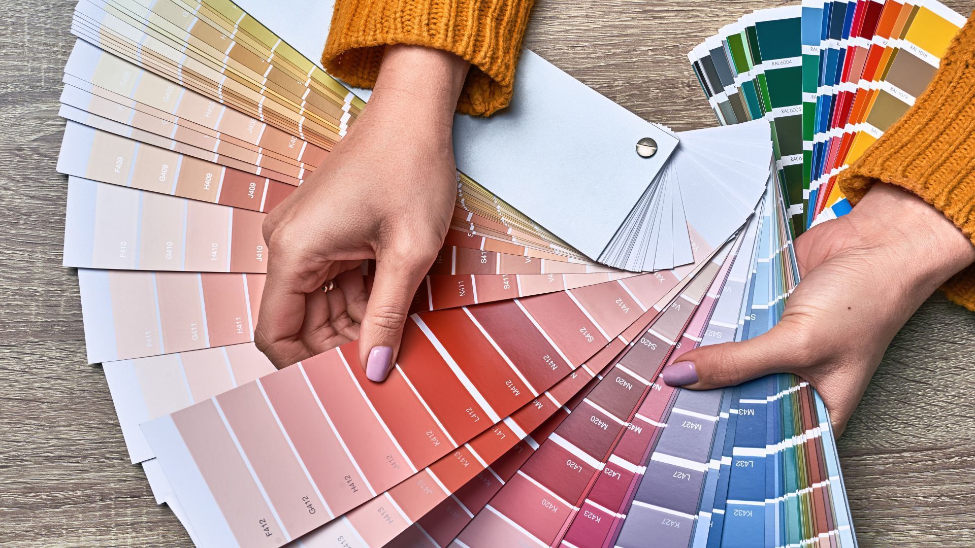
4. Use palette generators or sample swatches to test various combinations.
5. Finalize a consistent theme that ties the whole design together.
What Factors Should You Consider When Selecting Colors for Any Space?
Key factors include room size, natural light, functionality, existing décor, brand identity in commercial spaces, and personal taste in residential settings.
How Do Lighting and Space Size Affect Color Palette Choices?
Well-lit, spacious areas support bolder colors, while smaller or dimmer spaces prefer lighter hues. Natural light enhances color vibrancy, but artificial lighting can alter perceptions, requiring careful adjustment.
How Can You Use Color Palette Generators and Tools Effectively?
Online generators simulate how colors interact under different lighting and in varied room sizes, offering multiple options that can be refined with real samples to ensure a cohesive design outcome.
What Are the Latest Color Trends for Commercial and Residential Spaces?
Current trends blend sustainability with innovation. Commercial spaces increasingly favor eco-friendly, muted earth tones and soft greens that signal responsibility and modernity, enhanced by interactive lighting. Residential trends lean toward natural, organic hues—warm neutrals accented with deep blues or forest greens—to create a calming, nature-inspired atmosphere.
Which Colors Are Trending in Commercial Interior Design?
Trends favor colors that evoke trust and innovation, such as terracotta, olive, and slate gray, accented by vibrant touches like teal or burnt orange to add visual interest.
What Are Popular Residential Color Palettes This Year?
Home designs are trending toward nature-inspired colors: warm neutrals like beige and taupe paired with calming blues or sage greens, ensuring versatility and a relaxed, balanced feel.
How Are Sustainability and Eco-Friendly Colors Influencing Trends?
Both commercial and residential trends emphasize eco-friendly materials, low-VOC paints, and sustainable production. Nature-inspired hues help connect spaces to the environment while promoting well-being.
How to Compare Commercial vs. Residential Color Palette Considerations?
The main difference lies in objectives: commercial spaces value functionality, brand consistency, and customer engagement, while residential spaces prioritize personal expression and comfort. Commercial designs adhere to structured guidelines, whereas residential choices allow more creative freedom.
What Are the Main Contrasts in Color Palette Goals for Commercial and Residential Spaces?
Commercial palettes aim to optimize productivity and reinforce brand identity; residential palettes focus on ambiance, comfort, and personal style. This difference necessitates distinct approaches in hue, saturation, brightness, and overall composition.
How Do Functional and Emotional Needs Differ Between These Spaces?
Commercial environments need colors that enhance efficiency and professionalism without overwhelming, while residential settings require hues that evoke warmth and security for a more emotional, personal touch.
What Are Practical Tips for Balancing Aesthetics and Purpose in Both Settings?
For commercial spaces, use accent walls and branded colors to create consistency. In residential design, incorporate personalized accent pieces and artwork to maintain warmth without losing functionality.
Frequently Asked Questions
Q: How do commercial color palettes enhance brand identity?
A: They employ specific hues that mirror a brand’s image, ensuring consistency and building customer recognition and loyalty.
Q: Can residential color palettes impact mood and well-being?
A: Yes, personalized color choices promote relaxation, reduce stress, and create an environment that reflects the inhabitant’s personality.
Q: What role does lighting play in color selection for different spaces?
A: Lighting affects how colors appear; brighter areas support more vivid hues, while dimmer spaces may benefit from softer tones.
Q: How do sustainability trends influence modern interior color choices?
A: Both commercial and residential designs are increasingly using eco-friendly, nature-inspired palettes that promote environmental responsibility and overall well-being.
Q: Are there universal guidelines for choosing a color palette in any space?
A: Yes, considering the purpose of the space, natural light, room size, and testing with samples helps in selecting the ideal palette.
Final Thoughts
Choosing the right color palette for commercial versus residential spaces involves balancing functional needs with emotional impact. Commercial settings demand brand coherence and efficiency, while residential spaces foster personal expression and comfort. By understanding color psychology and current trends, designers can create environments that are both aesthetically appealing and highly functional. Whether revamping an office or refreshing a home, a systematic approach to color selection ensures that spaces are both beautiful and purpose-driven.